Lesson 07 - Advanced Plotting
In this lesson we will learn how to use the ggplot2 (based on the Grammar of Graphics) package to plot data in R. Although ggplot2 is complicated at first, it uses a very logical approach to plotting.
You can install ggplot2 with install.packages("ggplot2") and load it into your environment with library(ggplot2).
Code for this lesson can be found here.
Why ggplot2?
We just learned about plotting in base R. ggplot2 is another package by Hadley Wickham, that allows for plotting with a different approach than in base R, using a grammar of graphics (hence the package name).
Advantages
- More intuitive approach to plotting: ggplot2 makes it easy to create different plots with the same data, changing the plotting method or the grouping variable(s). It can also easily create plots that would require “hacky” code in base R (such as comparing density distributions).
- Creates better plots: ggplot2 makes it easier to create publication-quality plots, with fewer lines of code. It also creates legends automatically and easily for color, point size, and line type (among others), making it easy to compare different variables in a plot.1
- Enforces good plotting standards: The package is structured to enforce proper plotting techniques (for example, it does not support two different y-axes, or two different color scales on the same plot), which helps make sure plots are understandable.
Disadvantages
- Different syntax than base R plotting: All plotting functions in ggplot2 are used with different commands, which requires learning new functions in order to create good plots. Fortunately, there’s a cheat sheet.
- Requires structured, tidy data: Because ggplot2 requires that data be in a data frame, basic plots are still easier in base R than ggplot2. In addition, you have to make sure your data is tidy (long) before being able to plot in ggplot2.
- Enforces good plotting standards: Sometimes you want to make a plot that ggplot2 can’t/won’t support.
ggplot2’s support for legends is enough to make it worth learning, but in addition its versatility makes it really useful for creating detailed plots.
Plotting
ggplot2 takes a data frame (in tidy format) as an argument, and maps features of the data set onto the graph using aesthetics.
Scatter plots
Let’s start off with one of ggplot2’s default data set, diamonds, that lists diamond prices.
library(ggplot2)
> diamonds
# A tibble: 53,940 x 10
   carat       cut color clarity depth table price     x     y     z
   <dbl>     <ord> <ord>   <ord> <dbl> <dbl> <int> <dbl> <dbl> <dbl>
1   0.23     Ideal     E     SI2  61.5    55   326  3.95  3.98  2.43
2   0.21   Premium     E     SI1  59.8    61   326  3.89  3.84  2.31
3   0.23      Good     E     VS1  56.9    65   327  4.05  4.07  2.31
4   0.29   Premium     I     VS2  62.4    58   334  4.20  4.23  2.63
5   0.31      Good     J     SI2  63.3    58   335  4.34  4.35  2.75
6   0.24 Very Good     J    VVS2  62.8    57   336  3.94  3.96  2.48
7   0.24 Very Good     I    VVS1  62.3    57   336  3.95  3.98  2.47
8   0.26 Very Good     H     SI1  61.9    55   337  4.07  4.11  2.53
9   0.22      Fair     E     VS2  65.1    61   337  3.87  3.78  2.49
10  0.23 Very Good     H     VS1  59.4    61   338  4.00  4.05  2.39
# ... with 53,930 more rows
To plot carat vs. price using ggplot2, we call the ggplot function with our data set, and give it an aesthetic for the x and y axes. We also add a geom: how we want to visualize the data.
ggplot(diamonds, aes(x=carat, y=price)) +
    geom_point()
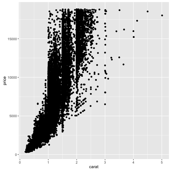
All plots in ggplot2 are created this way: with the first line being a data set (and optional aesthetics), and “adding” additional geoms or graphical parameters to the command.
Here, we’re defining the x and y aesthetics (with aes) in the ggplot2 call.
Adding plot variables
We can also define aesthetics within geom calls–for example, we can color by different aspects using the colour argument within aes.
ggplot(diamonds, aes(x=carat, y=price)) +
    geom_point(aes(colour=cut))
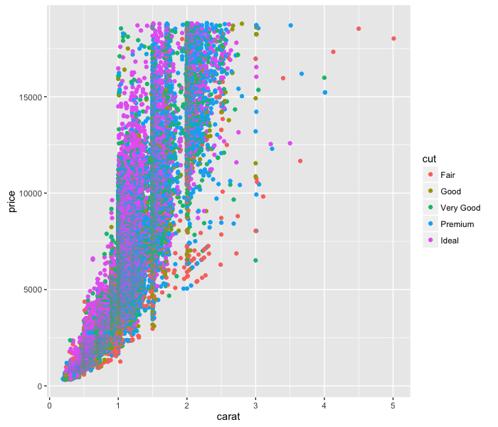
So easy!
References to columns in the data frame must be within calls to aes, or else you will get an error something like this:
> ggplot(diamonds, aes(x=carat, y=price)) +
+     geom_point(colour=cut)
Error in rep(value[[k]], length.out = n) :
  attempt to replicate an object of type 'closure'
The geom functions (e.g. geom_point) take other parameters in addition to aes. For example, try changing the transparency of the points using the following:
ggplot(diamonds, aes(x=carat, y=price)) +
    geom_point(aes(colour=cut), alpha=0.5)
Only mapping columns in a data frame to a graphical parameter should be inside of aes.
Axes
changing axis ranges
ggplot2 has a lot of commands for refining the plot axis.
Let’s take a look at some economics data:
> economics
# A tibble: 574 x 6
         date   pce    pop psavert uempmed unemploy
       <date> <dbl>  <int>   <dbl>   <dbl>    <int>
1  1967-07-01 507.4 198712    12.5     4.5     2944
2  1967-08-01 510.5 198911    12.5     4.7     2945
3  1967-09-01 516.3 199113    11.7     4.6     2958
4  1967-10-01 512.9 199311    12.5     4.9     3143
5  1967-11-01 518.1 199498    12.5     4.7     3066
6  1967-12-01 525.8 199657    12.1     4.8     3018
7  1968-01-01 531.5 199808    11.7     5.1     2878
8  1968-02-01 534.2 199920    12.2     4.5     3001
9  1968-03-01 544.9 200056    11.6     4.1     2877
10 1968-04-01 544.6 200208    12.2     4.6     2709
# ... with 564 more rows
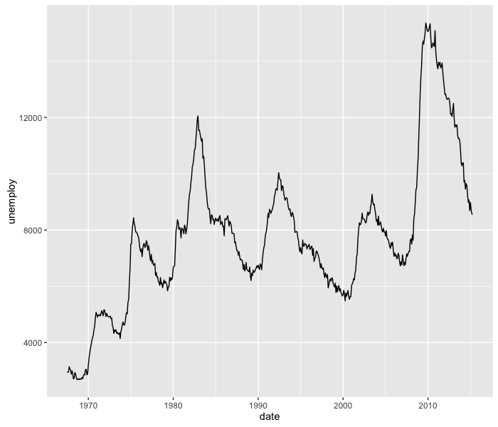
We can use geom_line to plot unemployment data over time.
ggplot(economics, aes(x=date, y=unemploy)) +
    geom_line()
If we’re only interested in the last 16 years, we can change the plotting limits using the coord_cartesian function:
ggplot(economics, aes(x=date, y=unemploy)) +
    geom_line() +
    coord_cartesian(xlim=c(as.Date("2000-01-01"), as.Date("2015-04-01")))
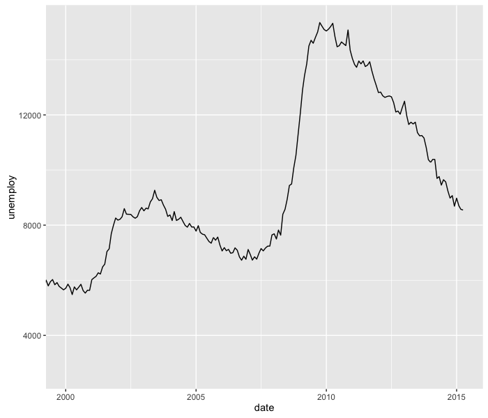
Because the date column is in Date format, we have to coerce the strings into Dates to adjust the plotting limits via the xlim argument.
How can we adjust the y-axis so that the y-axis range includes 0?
log scales
Using the data set msleep, which contains mammalian sleep data, we can plot body weight vs. brain weight:
ggplot(msleep, aes(x=brainwt, y=bodywt)) +
    geom_point(aes(colour=vore))
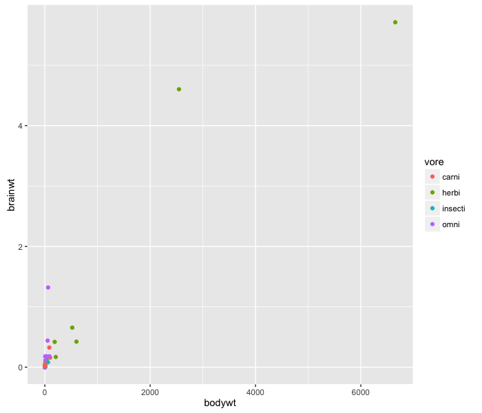
This data doesn’t look good on a scatter plot–probably because both the body weight and brain weight fall into an exponential distribution. Log-transforming this data will make visualizing it much better.
ggplot2 has the commands scale_x_log10 and scale_y_log10 to automatically change the scale of the axis without having to transform the data manually.
ggplot(msleep, aes(x=bodywt, y=brainwt)) +
    geom_point(aes(colour=vore)) +
    scale_x_log10() +
    scale_y_log10()
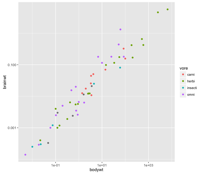
The plot looks much cleaner, and the relationship between body weight and brain weight is evident.
Density plots and histograms
ggplot2 also can display data as a histogram, much like the hist() function. Let’s look at another data set, midwest, that has demographic information about some Midwestern states. What percent of people are college-educated?
ggplot(midwest, aes(x=percollege)) +
    geom_histogram()
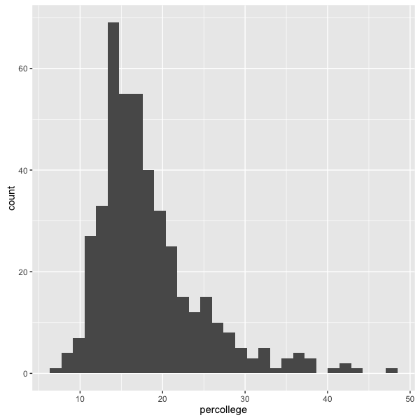
We can change the bin width using the binwidth argument, but for this plot the default width seems fine.
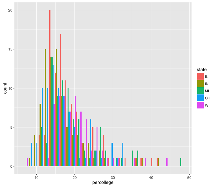
We can color the bars by state using the fill option, which functions very similarly to colour:
ggplot(midwest, aes(x=percollege)) +
    geom_histogram(aes(fill=state))
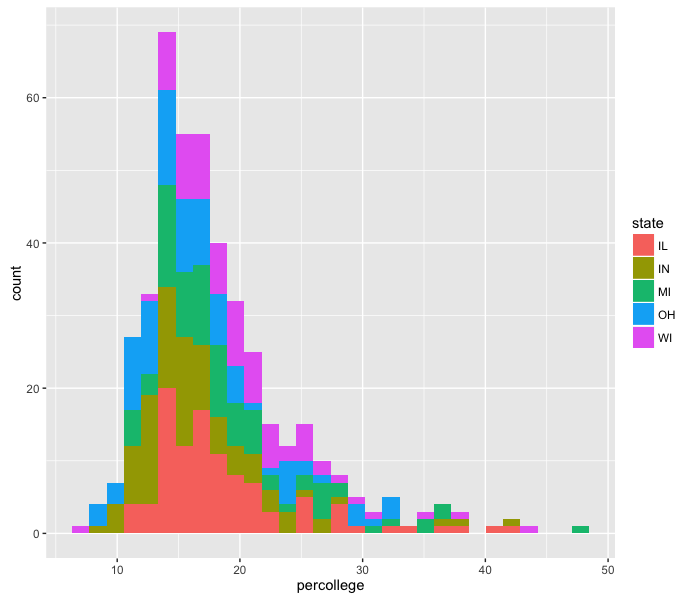
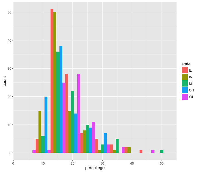
This method of plotting, with stacked bars, makes it difficult to see all the data. We can change that using the option position="dodge" inside the histogram call, which places the bars next to each other instead of stacked.
ggplot(midwest, aes(x=percollege)) +
    geom_histogram(aes(fill=state), position='dodge')
The resolution on this is too fine to see a difference. We can make the same plot, but change the bin size:
ggplot(midwest, aes(x=percollege)) +
    geom_histogram(aes(fill=state), position='dodge', binwidth=5)
Great! This is looking, if not publication-worthy, at least good enough to send to collaborators. However, the graph doesn’t have a title, and the x-axis label is not very descriptive. We can change the plot title and the axis labels using the labs function:
ggplot(midwest, aes(x=percollege)) +
    geom_histogram(aes(fill=state), position='dodge', binwidth=5) +
    labs(title='College attendance by state', x='Percent college')
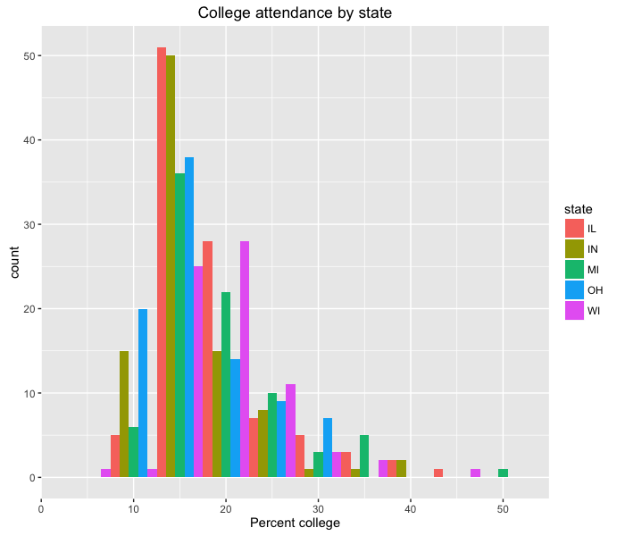
Note that here we’re adding another command to our ggplot2 set of function calls, again using +.
How would we change the y-axis label?
We can also create density plots using geom_density, using the fill option by state:
ggplot(midwest, aes(x=percollege)) +
    geom_density(aes(fill=state))
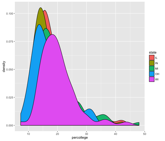
Unfortunately, these density plots overlap each other, so we need to add transparency:
ggplot(midwest, aes(x=percollege)) +
    geom_density(aes(fill=state), alpha=0.3)
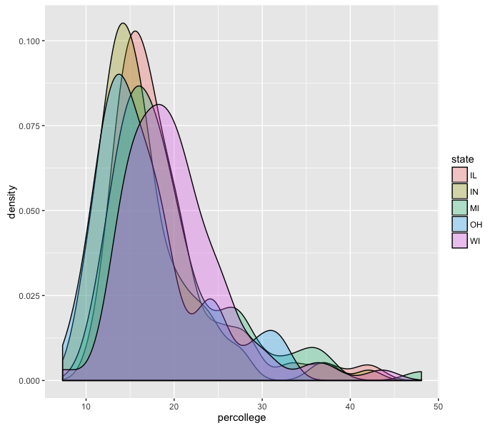
It seems like Wisconsin is the most-educated state out of these five.
What happens when you use colour instead of fill?
Boxplots
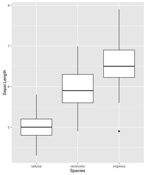
We can use the geom_boxplot function to create boxplots. For example, we can go back to our iris data:
ggplot(iris, aes(x=Species, y=Sepal.Length)) +
    geom_boxplot()
Using ggplot2, we can layer multiple geoms on the same plot. Boxplots let us see the distributions of the data, but we can add individual data points with geom_jitter (a “jittered” extension of geom_point).
ggplot(iris, aes(x=Species, y=Sepal.Length)) +
    geom_boxplot(outlier.color=NA) +
    geom_jitter(aes(colour=Species))
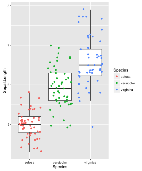
Displaying individual data points, in this organized fashion, gives a complete and easily-interpretable picture of the data.
Homework
- Add another geom that labels the species name for each point on the body weight vs. brain weight plot. (Hint: look at the examples in
?geom_text.) - Create a new plot displaying iris Sepal Length by Species, using
geom_violininstead of a boxplot. Try coloring by species, and then filling by species.
Resources
- ggplot2 cheat sheet
- Become a superhero, handle your data with R
- Colors in ggplot2
- Good tutorial: Introduction to R graphics with ggplot2
-
Base R, surprisingly, does not have good support for legends. You have to create legends manually (
?legend) and keep track of values between your legend arguments and the plot. ↩